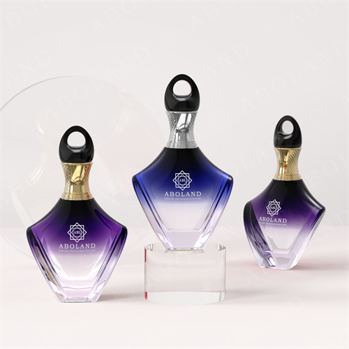
The Anatomy of a Luxury Perfume Bottle: 7 Design Choices That Signal Quality
Design
The Anatomy of a Luxury Perfume Bottle: 7 Design Choices That Signal Quality
By LUMORA Editorial · June 10, 2026 · 8 min read
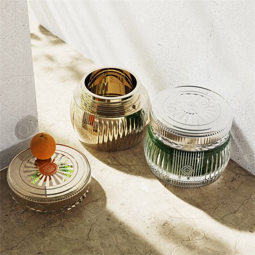
When a customer picks up a fragrance bottle on a retail shelf, they make a quality judgment in about three seconds. Most of that judgment is subconscious, based on physical and visual signals the bottle is sending. Here’s where those signals come from — and what they actually say.
1. Weight
The single most important quality signal is weight. A heavy bottle feels substantial, expensive, and durable. A light bottle feels cheap, fragile, and disposable — regardless of the actual content.
The base of the bottle is where most of the weight should be. A heavy base with lighter walls feels like a stone sitting on the shelf. A light base with heavy walls feels hollow and tippy. Heavy-base glass is a manufacturing choice we make on every bottle in the catalog — it’s roughly 15-20% more glass per bottle, and it reads at retail.
For a 100ml bottle, a target weight of 280-350g empty signals quality. Below 200g and the bottle reads as disposable. Above 400g and you’re spending on glass you’re not getting credit for.
2. Wall Thickness
The thickness of the glass walls is the second-most important signal. Thick walls communicate permanence; thin walls communicate disposability. The relationship isn’t linear — there’s a threshold below which the bottle reads as cheap, and a band above which more thickness doesn’t add quality perception.
For a 100ml bottle, the wall thickness band where quality reads is 3-5mm. Below 3mm and the bottle feels flimsy. Above 5mm and you’re overpaying for glass. Within that band, the eye reads quality and the hand reads substance.
3. The Base
The base is the part of the bottle that touches the shelf. A flat, smooth base reads as industrial. A slight recess — about 1-2mm — reads as crafted, because recessing requires an extra manufacturing step.
A polished base, where the bottom surface has been ground and polished smooth after molding, is the highest-quality finish. It catches light from underneath when the bottle is on a glass shelf, which signals quality from across the store. Polished bases add about 10-15% to bottle cost.
4. The Shoulder
The shoulder is the transition from the body to the neck. A sharp, angular shoulder reads as modern and engineered. A soft, rounded shoulder reads as classical and apothecary. A double-curve shoulder — where the body rounds into a flatter top before the neck — reads as couture.
The shoulder choice is one of the strongest positioning signals on the bottle. A niche brand using apothecary-style rounded shoulders signals craft. A prestige brand using sharp angular shoulders signals modern. A couture brand using double-curve shoulders signals heritage.
5. The Neck and Collar
The neck is where the bottle meets the closure. A well-proportioned neck — roughly 10-15% of total bottle height — reads as refined. A neck that’s too short feels stubby; a neck that’s too long feels fragile.
The collar is the metal or plastic ring that holds the closure. A polished metal collar reads as premium. A plastic collar reads as budget. For brands targeting the prestige and niche segments, the collar should be metal — zamac or aluminum — and should match the cap finish.
6. The Finish
The finish is the surface treatment of the glass: clear, frosted, tinted, gradient, or solid color. The finish choice has more impact on shelf presence than any other design element.
Clear glass communicates honesty — what’s inside is what you see. Frosted glass communicates refinement — a soft diffusion that flatters the liquid inside. Tinted glass communicates brand — the tint becomes part of the brand identity. Gradient glass communicates craft — the technique is hard to execute well, so it signals capability.
Each finish has its position. Clear is the universal default. Frosted is for premium and niche. Tinted is for brand-led positions. Gradient is for the few brands that need to be unmistakable.
7. The Cap
The cap is the part the customer touches first. A cap that feels heavy, fits precisely, and operates cleanly is the single strongest tactile quality signal on the bottle.
Weight matters here too — a heavy cap signals substance. Fit precision matters more — a cap that wiggles or rocks on the bottle reads as poorly made, even if it isn’t. Operation matters most — a cap that lifts off smoothly or closes with a satisfying snap signals quality every time the customer uses the product.
For zamac caps, the weight band that signals quality is 50-90g for a 100ml bottle. Below that and the cap reads as plastic. Above that and you’re spending on metal you’re not getting credit for.
Putting It Together
These seven choices — weight, wall thickness, base, shoulder, neck and collar, finish, and cap — are where quality signals come from on a luxury perfume bottle. Most brands get 4-5 of them right. The brands that customers perceive as best-in-class get all 7.
When we work with a brand on a custom bottle, we walk through each of these choices explicitly. The conversation usually takes 30-45 minutes, and it determines the entire downstream design and tooling approach.
Working on a fragrance project?
A customer picks up a bottle for about three seconds before deciding whether to put it back. Here’s where those three seconds go.
Talk to Our Team